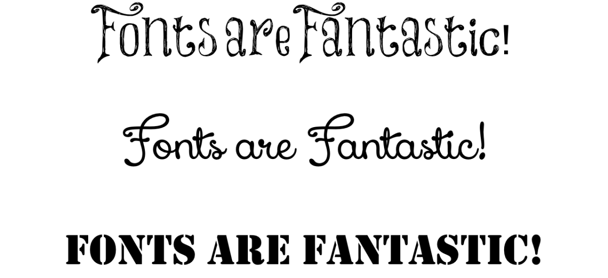
I’ve been reading a lot about design principles lately and one thing I keep going back to is typography and font choices. I absolutely love them and they were always my secret weapon in high school when I wanted my presentations to look interesting without overloading things (NOTE: This was totally not Microsoft Word “Word Art.” I’ve always been above that :))
Data vizzes are no different, and as the eloquent Emily (@echenty) puts it:
“Fonts are the braces of data visualisation. A good font = good teeth.”
Typography is important, and it can set your audience up for the tone of your work. Do you go with a professional Times New Roman? Or keep things chummy and cheery with everyone’s favourite (#sorrynotsorry), Comic Sans?
Here are 4 typography tips and tools that I use on a regular basis to help me choose and use my favourite fonts.
1. Dafont.com

My absolute favourite font site. I’ve used this for everything from business cards to file labels to rubber stamps. So many fonts, so little time! The nice thing about this site is that the fonts are well-categorised, and it also allows you to preview whatever text you want with whatever font you choose. A must-bookmark.
2. Microsoft Server 2008 Fonts

Let’s say you’ve gone through all the magical and wonderful fonts that are out there, finally found one that suits the mood you are trying to highlight in your viz, and installed it on your computer to create your masterpiece. When you’re designing on Tableau Desktop, everything looks peachy keen. But, when you go to publish your viz to Tableau public, your carefully-selected, beautiful, impactful font is whittled down to plain old ARIAL. This happens because Tableau Public only supports a select number of fonts and as of this writing, those fonts are the ones supplied by Microsoft Server 2008. If you still want to use your fancy fonts that are unsupported by Tableau Public, the trick is to create an image of your text (I like to use Powerpoint) and then add it to your dashboard as an image.
3. Fonts in Use

In Lorna’s (@lorna_eden) Krispy Kreme viz , she incorporates some excellent contextual design by using Krispy Kreme’s logo font as her title. If you need a logo font, it’s pretty easy to do a quick Google search and get the exact font used, or at least a close approximation. You can also browse through this website to see famous ad campaigns and the fonts that were used. I personally love browsing through the 60s campaigns and frequently use this site to recreate the aesthetic.
4. WTF

Get your mind out of the gutter, that is not the f-word we’re thinking of here! This is What the Font, a website you can use to upload any photo and identify the font used. They also have it in app form so you can identify fonts in the wild! If you’re finding it difficult to identify the font, you can post it in their forum where people will Sherlock things to figure out what you’re looking at. It’s also an interesting place to browse solved cases of fonts found in the wild.
**BONUS: I spent the weekend watching a pretty neat documentary about the history of Helvetica and how it grew to become a ubiquitous, ever-present font that surrounds every aspect of our lives. Check it out on YouTube here
